


Body:
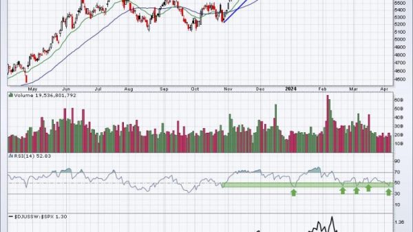
When it comes to financial analysis, one of the most crucial tools used by traders worldwide is chart analysis. However, an emerging trend points towards an issue of concerning magnitude. Many of these charts, highly relied on for decision-making, are exhibiting weaker and weaker indications.
The first aspect to delve into is understanding what it means for a chart to be weak. When a chart is identified as weak, it typically means the technical indicators reflecting the health of a stock or asset are showing signs of decline. This could be manifested in various ways such as prolonged downtrends, declining moving averages, lower peaks, or the incapability of a stock to reach previous highs.
One of the reasons why weak charts persist in getting weaker is the self-fulfilling prophecy ingrained in the minds of traders. The broad belief is that if a stock has been trending downwards, it is expected to continue in that same direction. This mindset has led investors to rely heavily on historical chart patterns, creating a bandwagon effect where an observed trend is expected to continue simply because it’s been that way before.
To take a deeper look, let’s consider market sentiment, which plays an essential role in chart performance. In periods of uncertainty, pessimism will often predominate, and this will inevitably reflect on the charts. The fear of loss triggers a sell-off which amplifies the weakness already exhibited in the charts.
However, it is worth noting that while weaker charts often get weaker, they don’t do so indefinitely. There is often a saturation point at which either a reversal or consolidation will occur. The reversal can be due to a shift in market sentiment, or a change in the underlying fundamentals of the asset. The key here is to be vigilant and seek the signs of such transitions.
Seasonality is another factor contributing to this. Certain markets or stocks may exhibit cyclical trends where certain periods inherently lead to weak charts. Recognizing these patterns could aid investors in strategizing their moves.
Quantitative easing, a monetary policy where a central bank purchases government securities or other securities from the market to lower interest rates and increase the money supply, could also be blamed for the sheer number of weak charts. Dampening real return expectations, it discourages investors from putting their money in the securities. This lack of interest then reflects as longer-term weakness on the charts.
Lastly, poor corporate performance contributes significantly to the escalation of weak charts. Whether it’s a missed earning estimate, a scandal, or an abrupt change in the management team, if a company’s performance dwindles, it causes a decrease in investor interest and trust, reflecting immediately on the charts as weakness.
In summary, weak charts getting weaker is a worrying trend and one that seems prevalent in today’s uncertain economic climate. It is a manifestation of a myriad of factors ranging from herd mentality, market sentiment, seasonality, monetary policies to poor corporate performances. It is essential for traders to be mindful of these influences when analyzing charts, so as to make well-informed decisions to navigate the market’s complexities diligently.